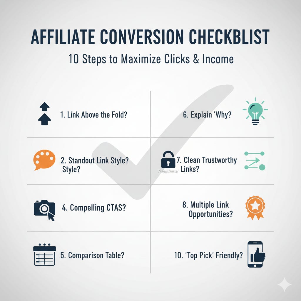
I Never Hit 'Publish' Without This 10-Step Checklist (It's My Affiliate Income Secret)
Unlock explosive growth and maximize your affiliate revenue with these surprisingly simple, must-do checks before your next post goes live.
Are You Leaving Money on the Table?
You spent hours, maybe even days, writing the perfect blog post. It’s helpful, it’s well-researched, and it’s full of great advice. You sprinkle in a few affiliate links, hit “publish,” and wait for the sales to roll in.
But they don’t. You get clicks on your article, but crickets on your affiliate dashboard.
What went wrong?
The truth is, just putting a link on a page isn’t enough. You have to be smart about it. You have to guide your reader’s eye and make clicking the link the most natural next step.
After years of testing, I developed a simple 10-point checklist. I run through this on every single article before it goes live. It takes less than 15 minutes, and it has made a world of difference in my affiliate income.
Today, I’m sharing it with you.
The 10-Point Pre-Publish Conversion Checklist
1. Is There a Link Above the Fold?
“Above the fold” is the part of the screen your reader sees without scrolling. This is your most valuable real estate! If your post is a product review or a list of “best” items, you need to place a link to your top recommendation right away. Don’t make people hunt for it.
Action: Place a clear, contextual affiliate link within the first two paragraphs.
2. Do Your Links Stand Out?
If your links are the same color and style as the rest of your text, they become invisible. Readers’ eyes will scan right over them. Your links need to be obvious and inviting.
Action: Make your links a different color (a bright, on-brand color works best) and consider making them bold. This small change makes them pop.
3. Are Your Calls-to-Action (CTAs) Compelling?
“Click here” is boring. It doesn’t inspire action. Your link text should tell the reader exactly what they will get when they click. Create urgency or curiosity.
Action: Instead of “Buy it here,” try “Check the Latest Price on Amazon” or “See All Available Colors Here.”
4. Are Your Images Clickable?
People love clicking on pictures. If you’re showing off a product, that beautiful, high-quality image should be a gateway to your affiliate offer. Not making your product images clickable is one of the biggest missed opportunities.
Action: Add your affiliate link to every product image in your post.
5. Does it Need a Comparison Table?
For any post that compares three or more products, a comparison table is a conversion goldmine. It allows readers to scan the key features and prices quickly. It makes their decision easier, and your job is to make things easy.
Action: Use a simple table plugin to create a comparison chart with the product name, a key feature, and a big, bright “Check Price” button for each item.
6. Have You Explained Your “Why”?
Don’t just link to a product. Tell a story. Explain why you recommend it. Did it solve a problem for you? What makes it better than the competition? A personal recommendation builds trust, and trust leads to clicks.
Action: Add a sentence or two before your link that shares a personal benefit or a key result.
7. Are Your Links Clean and Trustworthy?
Long, messy affiliate links full of random numbers and letters can look spammy. They can make readers hesitate. Using a link cloaking plugin (like Pretty Links) makes them clean and professional.
Action: Change amazon.com/product/dp/B0756CYW/ref=as_li_ss_tl_?ie=UTF8&linkCode=ll1 to something like yourwebsite.com/recommends/cool-product.
8. Do You Have Multiple Link Opportunities?
A reader might miss your first link. They might not be convinced until the end of the article. You need to give them several chances to click. This isn’t about being spammy; it’s about being helpful at every stage of their reading journey.
Action: Place your most important affiliate link in the intro, in a product box or table, and again in the conclusion.
9. Is There a “Top Pick” Box for Skimmers?
Most readers are skimmers. They want the answer now. A visually distinct “summary box” or “Our Top Pick” box near the top of the article is perfect for them. It highlights your best recommendation and gives them an immediate link to click.
Action: Create a colored box with a simple border. Inside, list your #1 product, a one-sentence reason why it’s the best, and a clear call-to-action button.
10. Is It Easy to Click on Mobile?
More than half of your readers are on their phones. Are your links big enough to be tapped easily with a thumb? Are your buttons spaced out? If it’s hard to click, people will simply give up.
Action: Pull up your preview on your phone. Try to click every link and button. If you have to pinch and zoom, your links are too small or too close together. Fix it!
By running through this checklist, you stop “hoping” for affiliate clicks and start designing for them. You make the reader’s journey seamless, build trust, and guide them directly to the solution they were looking for.
Try this on your next post. You’ll be amazed at the difference it makes.
Stephon Anderson


